Module 1: Project Overview and Documentation
Project Goal
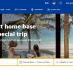
The goal of this project is to create a simplified clone of the AirBnb homepage using HTML and CSS. This project will help you understand how to build a structured web page and style it to closely resemble a popular website.
Technologies Used
- HTML5: To create the structure of the web page.
- CSS3: To style the web page and make it visually appealing.
- Unsplash: For freely available images to use in the project.
- Responsive Design Techniques: To ensure the website looks good on different devices.
Project Structure
HTML Structure (Module 2):
- Header section with a navigation menu.
- Hero section with a search form.
- Featured listings section with images and descriptions.
- Footer section with additional links.
CSS Styling (Module 3):
- General reset and basic styles for the body and container elements.
- Specific styles for the header, navigation, hero section, featured listings, and footer.
- Responsive design to ensure the layout adjusts on smaller screens.
Steps to Follow
Set Up the Project:
- Create a project folder and add the necessary files:
index.htmlandstyles.css. - Link the CSS file to the HTML file.
- Create a project folder and add the necessary files:
Create the HTML Structure:
- Define the basic structure of the HTML document.
- Create the header section with a navigation menu.
- Add the hero section with a search form.
- Create the featured listings section with images.
- Add the footer section.
Add CSS Styling:
- Apply general styles to reset default browser styles and set basic styles.
- Style the header and navigation menu.
- Style the hero section.
- Style the featured listings section.
- Style the footer.
- Add responsive design using media queries.
Resources
HTML and CSS Documentation:
Unsplash for Images:
Responsive Design Techniques:
Additional Tips
Test on Multiple Devices:
- Ensure the site looks good on different devices and screen sizes.
- Use browser developer tools to simulate different device viewports.
Code Comments:
- Add comments to your code to explain the purpose of different sections.
- This will help in maintaining and understanding the code in the future.
Clean Code:
- Keep your code clean and organized.
- Use consistent indentation and naming conventions.
By following this documentation and the subsequent modules, you will be able to create a basic clone of the AirBnb homepage that is visually similar and responsive. This project will help you understand how to structure a web page with HTML and style it effectively with CSS.
Module 2: HTML Structure
Here’s the HTML code that creates the basic structure of our AirBnb clone:
<!DOCTYPE html>
<html lang="en">
<head>
<meta charset="UTF-8">
<meta name="viewport" content="width=device-width, initial-scale=1.0">
<title>AirBnb Clone</title>
<link rel="stylesheet" href="styles.css">
</head>
<body>
<!-- Header section with navigation menu -->
<header>
<div class="container">
<h1>AirBnb</h1>
<nav>
<ul>
<li><a href="#">Places to stay</a></li>
<li><a href="#">Experiences</a></li>
<li><a href="#">Online Experiences</a></li>
</ul>
</nav>
</div>
</header>
<!-- Hero section with search form -->
<section class="hero">
<div class="container">
<h2>Book unique places to stay and things to do.</h2>
<form>
<input type="text" placeholder="Where are you going?">
<input type="date">
<button type="submit">Search</button>
</form>
</div>
</section>
<!-- Featured listings section -->
<section class="featured">
<div class="container">
<h2>Featured Listings</h2>
<div class="listings">
<div class="listing">
<img src="https://source.unsplash.com/300x200/?house" alt="House">
<h3>Cozy House</h3>
</div>
<div class="listing">
<img src="https://source.unsplash.com/300x200/?apartment" alt="Apartment">
<h3>Modern Apartment</h3>
</div>
<div class="listing">
<img src="https://source.unsplash.com/300x200/?villa" alt="Villa">
<h3>Luxury Villa</h3>
</div>
</div>
</div>
</section>
<!-- Footer section -->
<footer>
<div class="container">
<p>© 2024 AirBnb Clone</p>
</div>
</footer>
</body>
</html>
Explanation:
HTML Structure:
- Header Section: Contains the main title and navigation menu with links to different sections (e.g., Places to stay, Experiences).
- Hero Section: Includes a search form with a text input, date input, and a submit button.
- Featured Listings Section: Displays featured listings with images and captions.
- Footer Section: Contains a footer message.
Module 3: CSS Styling
Here’s the CSS code to style the HTML structure created above:
/* Reset some default browser styles */
* {
    margin: 0;
    padding: 0;
    box-sizing: border-box;
}

/* Set the basic font and line height for the body */
body {
    font-family: Arial, sans-serif;
    line-height: 1.6;
}

/* Container class to center the content and set a width */
.container {
    width: 80%;
    margin: auto;
    overflow: hidden;
}

/* Header styling */
header {
    background: #FF5A5F; /* AirBnb red background */
    color: #fff; /* White text color */
    padding-top: 30px; /* Padding at the top */
    min-height: 70px; /* Minimum height */
    border-bottom: #D73E3E 3px solid; /* Bottom border */
}

/* Header title styling */
header h1 {
    float: left; /* Float to the left */
    margin-top: 0; /* No margin at the top */
}

/* Navigation styling */
header nav {
    float: right; /* Float to the right */
    margin-top: 10px; /* Margin at the top */
}

/* Unordered list in the navigation */
header nav ul {
    list-style: none; /* Remove list style */
}

/* List items in the navigation */
header nav ul li {
    display: inline; /* Display inline */
    margin-left: 20px; /* Margin on the left */
}

/* Links in the navigation */
header nav ul li a {
    color: #fff; /* White color */
    text-decoration: none; /* Remove underline */
    font-weight: bold; /* Bold text */
}

/* Hero section styling */
.hero {
    padding: 50px 0; /* Padding top and bottom */
    background: url('https://source.unsplash.com/1600x900/?travel') no-repeat center center/cover; /* Background image */
    color: #fff; /* White text color */
    text-align: center; /* Center text */
}

/* Hero section title */
.hero h2 {
    margin-bottom: 20px; /* Margin at the bottom */
}

/* Hero form styling */
.hero form {
    display: flex; /* Flexbox layout */
    justify-content: center; /* Center items horizontally */
    align-items: center; /* Center items vertically */
}

/* Text input in the hero form */
.hero form input[type="text"],
.hero form input[type="date"] {
    padding: 10px; /* Padding */
    margin-right: 10px; /* Margin on the right */
    border: 1px solid #ccc; /* Gray border */
    border-radius: 5px; /* Rounded corners */
}

/* Hero form button */
.hero form button {
    padding: 10px 20px; /* Padding */
    border: none; /* No border */
    background: #FF5A5F; /* AirBnb red background */
    color: #fff; /* White text color */
    cursor: pointer; /* Pointer cursor on hover */
    border-radius: 5px; /* Rounded corners */
}

/* Featured section styling */
.featured {
    padding: 30px 0; /* Padding top and bottom */
    background: #fff; /* White background */
}

/* Featured section title */
.featured h2 {
    text-align: center; /* Center text */
    margin-bottom: 20px; /* Margin at the bottom */
}

/* Listings container */
.listings {
    display: flex; /* Flexbox layout */
    justify-content: space-around; /* Space around items */
}

/* Individual listing styling */
.listing {
    text-align: center; /* Center text */
}

/* Listing image styling */
.listing img {
    width: 100%; /* Full width */
    border-radius: 10px; /* Rounded corners */
}

/* Footer styling */
footer {
    padding: 20px 0; /* Padding top and bottom */
    background: #FF5A5F; /* AirBnb red background */
    color: #fff; /* White text color */
    text-align: center; /* Center text */
}

/* Responsive design for mobile devices */
@media (max-width: 768px) {
    .container {
        width: 90%; /* Increase width on smaller screens */
    }

    header nav ul li {
        display: block; /* Stack items vertically */
        margin-left: 0; /* Remove left margin */
        margin-bottom: 10px; /* Add bottom margin */
    }

    .hero form {
        flex-direction: column; /* Stack form elements vertically */
    }

    .hero form input[type="text"],
    .hero form input[type="date"],
    .hero form button {
        margin-right: 0; /* Remove right margin */
        margin-bottom: 10px; /* Add bottom margin */
    }

    .listings {
        flex-direction: column; /* Stack listings vertically */
    }

    .listing {
        margin-bottom: 20px; /* Add bottom margin */
    }
}
CSS Styling:
- Reset Styles: Resets some default browser styles using the
*selector. - Body Styles: Sets the font family and line height for the entire document.
- Container Class: Centers the content and sets a width.
- Header Styles: Styles for the header section, including background color, text color, padding, and border.
- Navigation Styles: Styles for the navigation menu, including list items and links.
- Hero Section Styles: Styles for the hero section, including background image and text alignment.
- Featured Section Styles: Styles for the featured listings section, including images and text.
- Footer Styles: Styles for the footer section.
- Responsive Design: Media queries to adjust styles for mobile devices, including stacking items vertically and adjusting margins.
This modular and commented approach helps in understanding each part of the project clearly and allows for easy customization and expansion.
Welcome to DevTechTutor.com, your ultimate resource for mastering web development and technology! Whether you're a beginner eager to dive into coding or an experienced developer looking to sharpen your skills, DevTechTutor.com is here to guide you every step of the way. Our mission is to make learning web development accessible, engaging, and effective.


