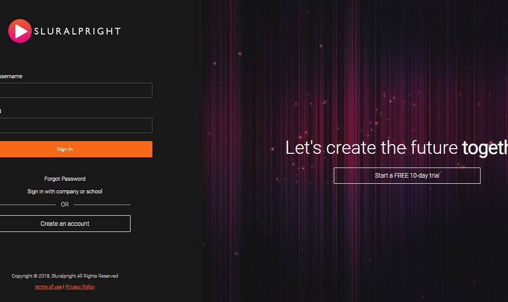
In this beginner-friendly article, we’ll take a closer look at a piece of HTML code which is used to structure a webpage for a login interface and promotional content. This type of webpage design is common on educational platforms, like Pluralsight, where users can sign in to access their accounts or start free trials.
Understanding the HTML Structure
Overall Layout
The code starts with a <div> tag having an id of “wrapper”. This <div> serves as a container that holds all other elements on the page, effectively splitting the screen into two main sections with nested <div> tags labeled “left” and “right”.
<div id="wrapper">
  <div id="left">...</div>
  <div id="right">...</div>
</div>
The Left Section
The left section is designed for user authentication. It contains another <div> with an id of “signin”, which includes several child elements:
- Logo: Inside the “signin”
<div>, there’s another<div>with a class of “logo” containing an<img>tag. This image represents the company’s logo and should visually identify the platform to the user.
<div class="logo">
  <img src="https://image.ibb.co/hW1YHq/login-logo.png" alt="Sluralpright" />
</div>
- Form for Authentication: A
<form>tag follows, including inputs for “Email or username” and “Password”. Labels are provided to indicate what each input field is for, enhancing user experience by making the interface easy to understand and interact with. The form also includes a “Sign In” button.
<form>
  <div>
    <label>Email or username</label>
    <input type="text" class="text-input" />
  </div>
  <div>
    <label>Password</label>
    <input type="password" class="text-input" />
  </div>
  <button type="submit" class="primary-btn">Sign In</button>
</form>
- Additional Links: Below the form, there are links for users who might need to reset their password or prefer to log in using their company or school credentials. These are placed within a
<div>having a class of “links”.
<div class="links">
  <a href="#">Forgot Password</a>
  <a href="#">Sign in with company or school</a>
</div>
- Account Creation: An additional option to create a new account is highlighted with the text “OR” and horizontal bars, making it visually distinctive. This is followed by a button for creating an account.
<div class="or">
  <hr class="bar" />
  <span>OR</span>
  <hr class="bar" />
</div>
<a href="#" class="secondary-btn">Create an account</a>
- Footer: The footer of the left section contains copyright information and links to terms of use and privacy policy, ensuring compliance and trust.
<footer id="main-footer">
<p>Copyright © 2018, Sluralpright All Rights Reserved</p>
<div>
<a href="#">terms of use</a> | <a href="#">Privacy Policy</a>
</div>
</footer>
The Right Section
The right section is geared towards marketing or promotional messages:
- Showcase Area: This section includes a
<div>with anidof “showcase” containing promotional content, such as a heading and a call to action for starting a free trial. This area is designed to be visually appealing and encourage user engagement.
<div id="showcase">
  <div class="showcase-content">
    <h1 class="showcase-text">
      Let's create the future <strong>together</strong>
    </h1>
    <a href="#" class="secondary-btn">Start a FREE 10-day trial</a>
  </div>
</div>
This is full code
<div id="wrapper">
<div id="left">
<div id="signin">
<div class="logo">
<img src="https://image.ibb.co/hW1YHq/login-logo.png" alt="Sluralpright" />
</div>
<form>
<div>
<label>Email or username</label>
<input type="text" class="text-input" />
</div>
<div>
<label>Password</label>
<input type="password" class="text-input" />
</div>
<button type="submit" class="primary-btn">Sign In</button>
</form>
<div class="links">
<a href="#">Forgot Password</a>
<a href="#">Sign in with company or school</a>
</div>
<div class="or">
<hr class="bar" />
<span>OR</span>
<hr class="bar" />
</div>
<a href="#" class="secondary-btn">Create an account</a>
</div>
<footer id="main-footer">
<p>Copyright © 2018, Sluralpright All Rights Reserved</p>
<div>
<a href="#">terms of use</a> | <a href="#">Privacy Policy</a>
</div>
</footer>
</div>
<div id="right">
<div id="showcase">
<div class="showcase-content">
<h1 class="showcase-text">
Let's create the future <strong>together</strong>
</h1>
<a href="#" class="secondary-btn">Start a FREE 10-day trial</a>
</div>
</div>
</div>
</div>This CSS code is crafted to style a web page that has been structured using HTML, as described in the previous response. The code makes use of Google Fonts, flexible box layout (flexbox), media queries, and various CSS properties to achieve a responsive and visually appealing design. Let’s break down the key sections of this CSS code to understand how they contribute to the overall look and functionality of the webpage.
Importing Fonts
@import url('https://fonts.googleapis.com/css?family=Roboto:300');This line imports the “Roboto” font at weight 300 from Google Fonts, ensuring that this font is available for use throughout the webpage. Roboto is known for its readability and modern appearance, making it a popular choice for web design.
Global Settings
* {
  box-sizing: border-box;
}
The box-sizing: border-box; property is applied to all elements (*). This makes element padding and borders included in the element’s total width and height, which simplifies layout design and avoids unexpected overflow.
Body Styling
body {
  font-family: 'Roboto', sans-serif;
  font-weight: 300;
  background: #181818;
  color: #fff;
  overflow: hidden;
}
This sets the default font and colors for the webpage. The background is dark (#181818), and all text (color) is white (#fff). The page’s overflow is hidden to prevent scrolling, which can be particularly useful for creating full-screen layouts without scroll bars.
Typography
h1, h2, h3, h4, h5, h6 {
  font-weight: 300;
}
All heading elements (h1–h6) use a light font weight (300), consistent with the imported Roboto font, enhancing the page’s clean and modern look.
Flexbox Layout
#wrapper {
  display: flex;
  flex-direction: row;
}
The wrapper uses a flexbox layout, dividing the child elements (#left and #right) into a row. This makes the sections sit side by side on larger screens.
Left Section
#left {
  display: flex;
  flex-direction: column;
  flex: 1;
  align-items: center;
  justify-content: center;
  height: 100vh;
}
The left section also employs flexbox, organizing its children in a column. It takes up equal space as the right section (flex: 1) and vertically centers its content in the viewport (100vh tall).
Right Section
#right {
  flex: 1;
}
Similar to the left section, it takes up the remaining space, ensuring balance.
Detailed Styling of Elements
The CSS includes specific styles for forms, buttons, inputs, and other components like images and links within the #signin and #showcase sections. These styles include margins, padding, text alignment, background colors, and hover effects to ensure that elements are not only visually appealing but also functional and easy to interact with.
Media Queries
@media (min-width: 1200px) {
  #left {
    flex: 4;
  }
  #right {
    flex: 6;
  }
}
This media query adjusts the flex properties of the #left and #right sections on screens wider than 1200px, giving more space to the #right section.
@media (max-width: 768px) {
  body {
    overflow: auto;
  }
  #right {
    display: none;
  }
  #left {
    justify-content: start;
    margin-top: 4vh;
  }
}
On smaller screens (less than 768px wide), the layout changes significantly for better mobile usability. The right section is hidden, scrolling is enabled on the body, and the left section’s content is realigned for optimal viewing and interaction.
Here is the full code
@import url('https://fonts.googleapis.com/css?family=Roboto:300');

* {
  box-sizing: border-box;
}

body {
  font-family: 'Roboto', sans-serif;
  font-weight: 300;
  background: #181818;
  color: #fff;
  overflow: hidden;
}

h1,
h2,
h3,
h4,
h5,
h6 {
  font-weight: 300;
}

#wrapper {
  display: flex;
  flex-direction: row;
}

#left {
  display: flex;
  flex-direction: column;
  flex: 1;
  align-items: center;
  justify-content: center;
  height: 100vh;
}

#right {
  flex: 1;
}

/* Sign In */
#signin {
  display: flex;
  flex-direction: column;
  justify-content: center;
  align-items: center;
  width: 80%;
  padding-bottom: 1rem;
}

#signin form {
  width: 80%;
  padding-bottom: 3rem;
}

#signin .logo {
  margin-bottom: 8vh;
}

#signin .logo img {
  width: 300px;
}

#signin label {
  font-size: 0.9rem;
  line-height: 2rem;
  font-weight: 500;
}

#signin .text-input {
  margin-bottom: 1.3rem;
  width: 100%;
  border-radius: 2px;
  background: #181818;
  border: 1px solid #555;
  color: #ccc;
  padding: 0.5rem 1rem;
  line-height: 1.3rem;
}

#signin .primary-btn {
  width: 100%;
}

#signin .secondary-btn,
.or,
.links {
  width: 60%;
}

#signin .links a {
  display: block;
  color: #fff;
  text-decoration: none;
  margin-bottom: 1rem;
  text-align: center;
  font-size: 0.9rem;
}

#signin .or {
  display: flex;
  flex-direction: row;
  margin-bottom: 1.2rem;
  align-items: center;
}

#signin .or .bar {
  flex: auto;
  border: none;
  height: 1px;
  background: #aaa;
}

#signin .or span {
  color: #ccc;
  padding: 0 0.8rem;
}

/* Showcase */
#showcase {
  display: flex;
  justify-content: center;
  align-items: center;
  background: url('https://image.ibb.co/cO9Lxq/login-bg.jpg') no-repeat center center / cover;
  height: 100vh;
  text-align: center;
}

#showcase .showcase-text {
  font-size: 3rem;
  width: 100%;
  color: #fff;
  margin-bottom: 1.5rem;
}

#showcase .secondary-btn {
  width: 60%;
  margin: auto;
}

/* Footer */
#main-footer {
  color: #ccc;
  text-align: center;
  font-size: 0.8rem;
  max-width: 80%;
  padding-top: 5rem;
}

#main-footer a {
  color: #f96816;
  text-decoration: underline;
}

/* Button */
.primary-btn {
  padding: 0.7rem 1rem;
  height: 2.7rem;
  display: block;
  border: 0;
  border-radius: 2px;
  font-weight: 500;
  background: #f96816;
  color: #fff;
  text-decoration: none;
  cursor: pointer;
  text-align: center;
  transition: all 0.5s;
}

.primary-btn:hover {
  background-color: #ff7b39;
}

.secondary-btn {
  padding: 0.7rem 1rem;
  height: 2.7rem;
  display: block;
  border: 1px solid #f4f4f4;
  border-radius: 2px;
  font-weight: 500;
  background: none;
  color: #fff;
  text-decoration: none;
  cursor: pointer;
  text-align: center;
  transition: all 0.5s;
}

.secondary-btn:hover {
  border-color: #ff7b39;
  color: #ff7b39;
}

/* Media Queries */
@media (min-width: 1200px) {
  #left {
    flex: 4;
  }

  #right {
    flex: 6;
  }
}

@media (max-width: 768px) {
  body {
    overflow: auto;
  }

  #right {
    display: none;
  }

  #left {
    justify-content: start;
    margin-top: 4vh;
  }

  #signin .logo {
    margin-bottom: 2vh;
  }

  #signin .text-input {
    margin-bottom: 0.7rem;
  }

  #main-footer {
    padding-top: 1rem;
  }
}
Welcome to DevTechTutor.com, your ultimate resource for mastering web development and technology! Whether you're a beginner eager to dive into coding or an experienced developer looking to sharpen your skills, DevTechTutor.com is here to guide you every step of the way. Our mission is to make learning web development accessible, engaging, and effective.


